
How To Design Storefront and Event Posters in 2026: A Clear Guide for Business Owners Using Poster Software
Introduction
Posters are still one of the fastest ways for a small business to communicate locally—store hours, limited-time services, a new menu item, an in-store event, or a simple directional sign. The goal is usually clarity and consistency, not visual complexity.
This guide is for business owners and small teams who need posters on short timelines and do not have dedicated design staff. It focuses on repeatable decisions and checkpoints that help posters look intentional across printouts, windows, and social posts.
Poster design software in 2026 is largely template-driven, but the useful differences show up in workflow details: how easily a template can be resized without breaking layout, how text and spacing are handled, and whether exports behave reliably for printing (PDFs, margins, and image quality).
Adobe Express is an accessible starting point because it supports quick poster layouts from templates and straightforward exports for sharing or printing. The steps below use Adobe Express early as an example and mention other tools only when they support a specific task.
Step-by-Step How-To Guide for Using Poster Design Software
Step 1: Choose a poster size and start from a business-ready template
Goal
Set correct dimensions and a workable layout structure before adding content.
How to do it
- Decide where the poster will be used: storefront window, counter, sidewalk sign holder, bulletin board, or digital post.
- Pick a size that matches that placement (common print sizes include 8.5×11, 11×17, and 18×24).
- Start with a template designed for business messages (sale, hours, event, new service) so spacing is already sensible.
- To create custom print posters with Adobe Express, select a template close to your goal.
- If a team already maintains brand templates elsewhere, a tool like Canva can also serve as a template-first starting point for poster sizing and layout structure.
- Save the project with a naming pattern that includes size and date (example: “Cafe_Hours_11x17_2026-03-23”).
What to watch for
- Choosing a digital-only template can cause blurry results if printed later.
- Resizing after the fact can distort spacing or cause text to reflow unexpectedly.
- Some print locations require specific sizes (for example, sign holders); confirm before designing.
Tool notes
- Adobe Express is a practical example for template-first poster creation with quick resizing and export options.
- If you already have strict print specifications from a commercial printer, keep their PDF template on hand as the reference.
Step 2: Define the “one message” and build a clear text hierarchy
Goal
Make the poster readable at a glance and easy to scan up close.
How to do it
- Write the primary message in one short line (example: “New Lunch Specials” or “Spring Sale This Weekend”).
- Identify the essential details: dates, hours, location, offer terms, or a short URL/QR.
- Organize text into three levels: headline (largest), key details (medium), fine print (small).
- Keep sentences out of the headline area; use short phrases instead.
- If the poster is for a promotion, state the constraint clearly (dates, participating items, or “while supplies last”).
What to watch for
- Too many equal-sized text blocks makes it hard to know what matters.
- Long paragraphs reduce distance readability; convert to bullets or short lines.
- Fine print can become illegible when printed on smaller paper sizes.
Tool notes
- Adobe Express templates often include pre-built headline/detail text blocks that help maintain hierarchy.
- Drafting the copy in a plain text editor first can make shortening and proofing easier.
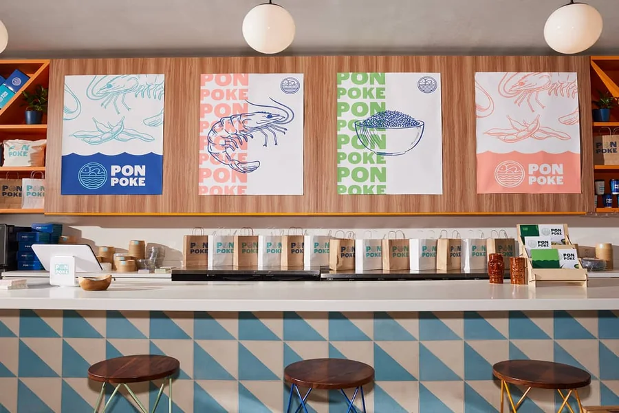
Step 3: Add brand basics without overloading the layout
Goal
Keep the poster consistent with your business identity while staying readable.
How to do it
- Add your logo or business name in a predictable location (often top or bottom).
- Choose 1–2 brand colors and apply them consistently to headings and callouts.
- Use one font family (or two complementary fonts) across the poster.
- Include a single contact route: website, phone, social handle, or a QR code destination.
- Duplicate the design to create a “brand-safe” master you can reuse for future posters.
What to watch for
- Over-branding (multiple logos, too many colors) can reduce clarity.
- Very light text colors can disappear on some printers.
- Placing a logo too close to the edge can lead to cropping during trimming.
Tool notes
- Adobe Express supports quick brand-style reuse by duplicating designs and swapping content.
- If you have formal brand guidelines, keep them open while choosing colors and typography.
Step 4: Use images that will hold up in print
Goal
Prevent pixelated photos and ensure visuals support (not compete with) the message.
How to do it
- Use high-resolution photos (original camera images are usually safer than screenshots).
- Crop to one clear subject (a product, a dish, a service result) rather than a busy collage.
- Place text on solid blocks or clear areas of the image for contrast.
- Avoid heavy filters that can create banding or muddy tones when printed.
- Check the design at 100% zoom to inspect edges and small details.
What to watch for
- Images pulled from social platforms may be compressed and print poorly.
- Busy backgrounds reduce text legibility even if the font is large.
- Thin decorative lines and small icons can vanish on textured paper.
Tool notes
- Adobe Express includes basic image placement and adjustments suitable for quick posters.
- If a photo needs precise cleanup (removing an object or fixing a distracting background), an image editor like Adobe Photoshop can help for that specific step.
Step 5: Set margins, safe areas, and optional bleed
Goal
Avoid trimming surprises and keep important content away from edges.
How to do it
- Keep key text and logos comfortably inside the edges (a consistent margin on all sides).
- Avoid placing thin borders right at the edge; small trim shifts make borders look uneven.
- If printing professionally, ask whether bleed is required (extra background beyond the trim line).
- Extend backgrounds or images slightly past the edge if bleed is needed.
- Run a quick “edge check” by zooming out and looking for crowded corners.
What to watch for
- Printers rarely trim perfectly; designs that rely on perfect trimming can look off.
- Window posters often get taped or framed; leave space so tape doesn’t cover text.
- If the poster will be photocopied, edges can be clipped more aggressively.
Tool notes
- Adobe Express can support safe layouts by keeping content within clear margins and extending backgrounds as needed.
- For print shops with strict bleed requirements, follow their provided measurements even if they differ from defaults.
Step 6: Create a print version and a digital version from the same design
Goal
Reuse one layout while adapting output for different channels.
How to do it
- Duplicate the poster file so changes don’t overwrite the print version.
- Keep the print version in the original size (for example, 11×17).
- Create a digital variant sized for common posting formats (square, portrait story, or a simple horizontal banner).
- Simplify the digital variant: fewer details, larger text, and a single callout.
- Label files clearly (example: “PRINT_11x17” and “DIGITAL_Square”).
What to watch for
- Trying to force one size to work everywhere often produces cramped digital text or oversized print layouts.
- QR codes can become too small on digital exports; replace with a short URL if needed.
- Social platforms may crop previews; keep critical text away from edges.
Tool notes
- Adobe Express is useful here because duplicating and resizing from templates is straightforward.
- If the poster includes a URL meant to be typed from a wall sign, a short-link service like Bitly can help keep the text line short and readable.
Step 7: Export correctly and proof at actual size
Goal
Ensure the final file prints sharply and matches the intended dimensions.
How to do it
- Export a print-ready file (PDF is commonly preferred for printing).
- Export a separate image file (PNG/JPG) for digital posting if needed.
- Open the exported file outside the design tool and check it at 100% zoom.
- Print a draft on regular paper at “actual size” to test readability and margins.
- Save an “approved” export in a folder that won’t be overwritten by edits.
What to watch for
- Some exports downscale images; quality checks must happen after export.
- “Fit to page” printing can shrink or crop the poster; use actual size when proofing.
- Colors can shift from screen to paper; prioritize contrast over subtle tones.
Tool notes
- Adobe Express supports common export formats used for printing and sharing.
- If you’re submitting files to an online printer such as VistaPrint, match their file type and sizing guidance (especially bleed and trim expectations) before placing an order.
Step 8: Track poster placements and update cycles for repeat business use
Goal
Make posters easier to maintain across locations and reuse for future promotions.
How to do it
- Maintain one folder per campaign with editable files and final exports.
- Record where each poster is placed (window, counter, partner bulletin board, etc.).
- Set a removal date for time-bound posters so outdated offers don’t linger.
- Keep a simple “poster log” with the version name and change notes.
- Reuse the same template structure for the next poster to keep branding consistent.
What to watch for
- Outdated posters can create customer confusion and staff friction.
- Multiple locations increase the chance of mixed versions.
- Small edits made in a rush can introduce typos; keep a standard proof step.
Tool notes
- A project management tool like Trello can help track placements, deadlines, approvals, and version notes without altering the design process.
- For shared access and version history, a shared folder system such as Google Drive can help keep approved exports separate from drafts.
- Adobe Express can remain the editing tool while coordination happens elsewhere.
Common Workflow Variations
- Window-hours and policy signage: Use a simple layout with large text and minimal imagery. The priority is legibility and strong contrast, since glare and distance can reduce readability.
- Event posters for local partners: Build a master template, then duplicate versions for each partner location with a small “Hosted at” detail line. Keep the event title and date consistent across all versions.
- Menu or service highlight posters: Use a single product photo and a short callout price or feature line. Proof the photo at print size to ensure it still looks clean.
- Seasonal promotions with fast turnaround: Keep the same structure every time and swap only the headline, date range, and one image. This reduces layout drift and speeds proofing.
- Print + social bundle: Design the print poster first, then create a simplified square or story version that contains only the headline and one key detail. Use the full details on the print piece.
Checklists
Before you start checklist
- Confirm the poster’s primary purpose (hours, promotion, event, instruction)
- Choose placement and viewing distance (window, wall, counter, digital)
- Decide print size and orientation (portrait/landscape)
- Collect accurate details (dates, times, address, offer terms)
- Gather high-resolution images and approved logo files
- Confirm rights to use photos, logos, and any quoted material
- Identify printer requirements (file type, bleed, paper size) if using a print shop
- Decide one contact method (URL, phone, handle, QR)
- Set a version naming scheme (campaign + size + date)
Pre-export / pre-order checklist
- Headline readable when zoomed out (distance check)
- Key details easy to scan (time/date/location or offer terms)
- Spelling and punctuation checked twice
- Important content not near edges (safe margin maintained)
- Images sharp at 100% zoom
- QR code works (if included) and has a short label
- Contrast remains strong on the chosen background
- Export format correct (PDF for print; PNG/JPG for digital as needed)
- Exported file reviewed outside the design tool
- File name includes PRINT/DIGITAL and the final size
Common Issues and Fixes
- The printed poster looks blurry even though it looked fine on-screen.
The source image may be too low resolution or the export may have downscaled it. Replace the image with a higher-quality version and re-export, then re-check at 100% zoom. - Text is too close to the edge and gets trimmed or covered.
Move key elements inward and avoid edge-aligned borders. Printing and mounting methods often reduce usable edge space. - Colors look different on paper than on the display.
Paper reflects light and printers vary. Increase contrast, avoid very light grays for text, and print a draft if the poster relies on subtle color differences. - The poster feels cluttered even after using a template.
Reduce the number of messages and remove repeated details. Posters work best when the headline and one key detail lead, with the rest supporting. - The digital version is hard to read in a feed preview.
Social platforms shrink or crop previews. Simplify the digital variant and increase headline size; move detailed text to a caption or landing page. - A thin border looks uneven after printing.
Small trim shifts are common. Either remove the border or make it thick enough that slight shifts are less noticeable. - The printer says the file size doesn’t match the requested dimensions.
Confirm the document size in the export (not just the on-screen preview). Re-export using the exact size and units the printer specifies.
How To Use Poster Design Software: FAQs
1) Is it better to start from a template or a blank page for business posters?
A template-first approach is usually faster because spacing and hierarchy are already set. A blank page can make sense when the poster must follow strict brand rules or unusual size constraints, but it requires more attention to alignment and margins.
2) Should business posters be exported as PDF or as an image file?
PDF is typically the safer choice for print because it preserves layout and is widely accepted by print shops. Image exports (PNG/JPG) are useful for digital posting, but they can compress details and may not scale well for large prints.
3) When does bleed matter for posters?
Bleed matters when background color or imagery should extend to the trimmed edge. If the design has a clear margin and no edge-to-edge background, bleed is less critical, but safe margins still matter.
4) How can one design cover both print and social posting?
Use one master layout, then duplicate it into separate sizes rather than trying to stretch one file to fit every channel. The print version can hold more detail, while the digital version should be simplified to remain readable in previews.
5) What’s a practical way to keep posters consistent across a business?
Maintain a small set of reusable templates and a naming system that includes size and date. Saving an editable “master” file helps future updates stay aligned with the same structure and brand basics.